Open a Coke

Introduction- This a great ad campaign for Coca-Cola. It is appealing to all genders and ages. Who doesn’t want to be happy? Who doesn’t want to open something that will make them feel goo? It is simple, yet memorable.

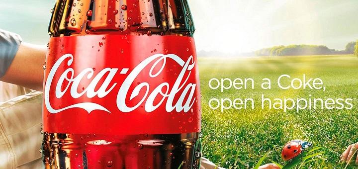
The credit for the image: https://wordstream-files-prod.s3.amazonaws.com/s3fs-public/styles/simple_image/public/images/media/images/persuasive-ads-coca-cola.jpg?KTsO
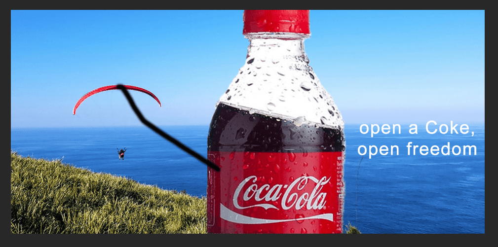
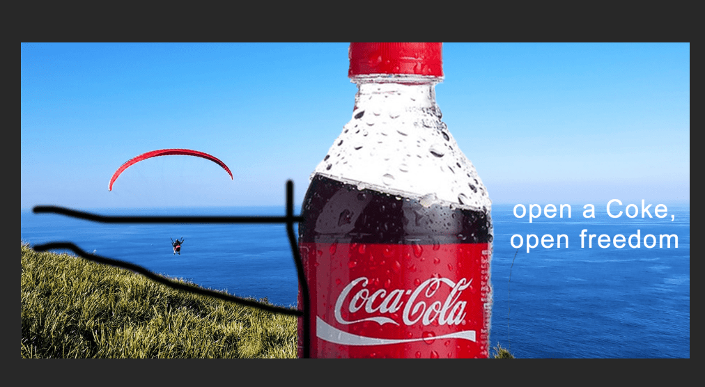
One element of design in this ad is proximity. The sun is shining in the distance, with the coke bottle up front.
The typography of the sentence is contrasting the label of the coke logo. Both are the white, but the size and font otherwise are completely different.
Another element of design is the bold lines of the bottle.
One thing in this ad that works with the color is the red ladybug (small) and the coke bottle (big).

New Design

My ad utilizes the same red highlight theme. Red skydiving and red label.
The proximity is also noted. While the ocean goes on forever, you can tell the bottle is the prominent feature.
Typography is contrasting, the logo is super fancy, but the sentence is plain.
The power of lines is shown here.

Summary

I feel like the two ads go together because of the similarities with design, color and typography. The idea that when you open a coke you open something good, be it happiness or freedom is also relevant. The ads definitely could be used with the same/similar ad campaign.

Design a site like this with WordPress.com
Get started