Open a Coke

Introduction- This a great ad campaign for Coca-Cola. It is appealing to all genders and ages. Who doesn’t want to be happy? Who doesn’t want to open something that will make them feel goo? It is simple, yet memorable.

The credit for the image: https://wordstream-files-prod.s3.amazonaws.com/s3fs-public/styles/simple_image/public/images/media/images/persuasive-ads-coca-cola.jpg?KTsO

One element of design in this ad is proximity. The sun is shining in the distance, with the coke bottle up front.
The typography of the sentence is contrasting the label of the coke logo. Both are the white, but the size and font otherwise are completely different.
Another element of design is the bold lines of the bottle.
One thing in this ad that works with the color is the red ladybug (small) and the coke bottle (big).

New Design

My ad utilizes the same red highlight theme. Red skydiving and red label.
The proximity is also noted. While the ocean goes on forever, you can tell the bottle is the prominent feature.
Typography is contrasting, the logo is super fancy, but the sentence is plain.
The power of lines is shown here.

Summary

I feel like the two ads go together because of the similarities with design, color and typography. The idea that when you open a coke you open something good, be it happiness or freedom is also relevant. The ads definitely could be used with the same/similar ad campaign.

Soaring and Flying

Introduction

For this project I am using a magazine article from the online magazine, “About Town”. It is an online magazine marketed to home, businesses and hotels. I found a great article that will allow me to show and demonstrate skills that were recently learned. The link to the magazine is http://abouttownmagazines.com/

Lake Elsinore Article

Analysis

The categories of typeface that are used are sans serif and script. Because they are used together in the heading, it gives a visual appeal with the two different types of typefaces.

The elements that make them contrast is one is a script, or a typeface that appears to have been handwritten or hand printed. It is not the main typeface here, it is used sparingly as advised. The other one that is used is sans serif. It is a monoweight type and the strokes are all the same.

The photographer used both leading lines and depth of field. There are multiple places in the picture that lines are used. The clouds appear to be in a line and so do the people that are skydiving. Additionally the small picture in the right hand corner also used the principle of leading lines with a long path. Depth of field is used as you can see the mountains in the background and the city or town below.

Additional Photos

Because I am not able to get photos of skydiving, I chose some additional photos that highlight leading lines and depth of field.

Leading Lines in the sky
Leading Line-Trees and Depth of Field with close flowers and far away trees
Leading Lines with clouds and the top of the waterfall

Conclusion

The magazine layout was very appealing and used various elements to create a layout that was eye catching. I think using lines and depth in photographs can be simple, yet have a profound effect. Using a variety of typefaces, while still making sure they compliment each other is also important.

New Can, Old Classic

Coco-Cola ImageThe purpose of this Reverse Engineer Project is to analyze the use of the four basic principles of design that should appear in well-designed ads.

  • Proximity
  • Repetition
  • Alignment
  • Contrast

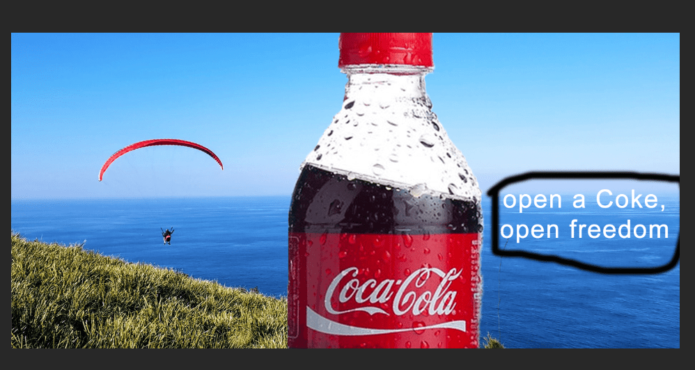
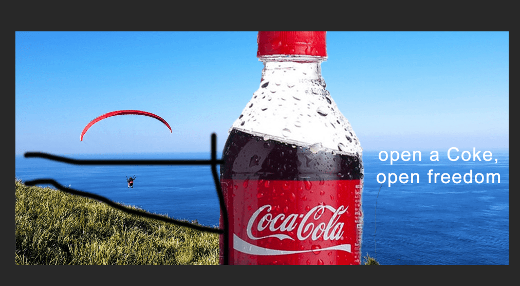
Link: Coco-Cola by advertisingrow.com
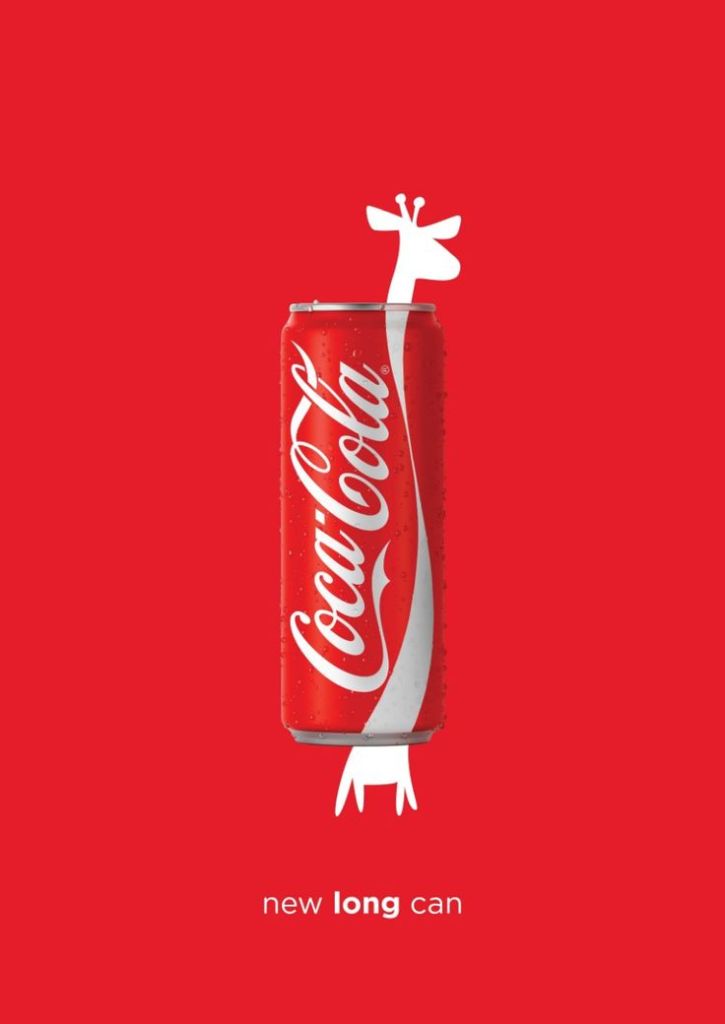
Proximity

Proximity

In this ad, there is no fear of empty space. The giraffe and the coke can are related, because they are both long so they are placed one on top of the other. Because there is in just one image centered on the page, there is only one place for your eyes to go. There is no question where to look. There is no question about  the focus of the ad. Just below the ad is the slogan. The proximity to the can shows the relevance to the image.

Repetition

The colors red and white use the principle of repetition. Because the entire ad is red and white, it is more than just being consistent with colors, it is a conscious effort to repeat with just two colors. The colors unify the ad. Everyone knows that red and white=coke.

Alignment

All the items on this page are aligned. Nothing is arbitrarily placed. It is centrally aligned purposefully. The slogan is aligned just beneath the can to present a cohesive unit. It has a clean, organized and minimalist look. You can see a strong line running down the center. The alignment creates a calm feeling. The alignment of the giraffe behind the can creates the image of the can being the neck.

Contrast

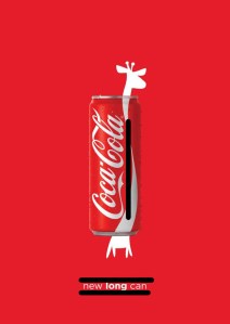
One way contrast is created in this ad is in the fonts. Two very different fonts are used. It is said that if two items are not the exactly the same they should be completely different. That is true with the fonts used. Not only the type of font, but the size of font is totally different as well. Another contrast with the font is one word is going vertical and the slogan is going horizontal.

Conclusion

In this ad by Coca-Cola the four basic principles of design are clearly implemented. The contrast of fonts is powerful. The repetition of the classic red and white colors is familiar. The central alignment is done with purpose. The proximity of the slogan and the can create one visual unit. The final result being a simple, but effective advertisement. It is clever in its use of a giraffe known as the animal with a long neck.

Design a site like this with WordPress.com
Get started